Introduction
Line charts are a beautiful way to show trends. In fact, it is the best way to show trends. Line charts are hard to avoid since too many people, organizations, companies, and agencies make full use of them for marketing purposes. Then there are the evergreen pictures of the stock market boom (or crash) with accompanying line charts. Every time the market goes up or comes down, we are destined to see a prototypical line chart as the thumbnail or the cover photo. In this post, we will discuss line charts, how they can be used, and how to plot them using python. For this purpose, we will be using a popular third-party data visualization module called matplotlib.
Objectives
- Learn about line charts
- Learn how to plot them in python
Line charts
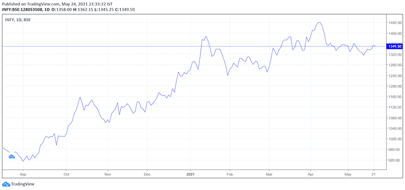
A line chart also known as a line graph/plot is used to represent data over a continuous variable. Most likely, this continuous variable is time which could be in seconds, minutes, hours, days, weeks, months, or years. As long as the interval chosen is fixed, the line graph will make sense. These time intervals are called bins. The data during each interval is quantified. The continuous variable is represented along the x-axis and the data is represented along the y-axis. The dots are marked. Each dot is connected using a straight line which produces a line chart. Below is an example of a line chart that shows the price change of stock INFY (Infosys) in the Bombay stock exchange.
Generated using tradingview.com
As we can see, the time span (continuous variable) is plotted along the x-axis and price values (data) are plotted along the y-axis. Since the actual graph is interactive, the original plot contains dots that indicate daily closing price although only months are indicated on the x-axis. Otherwise, the graph would have looked bumpy.
Please note: Just because a line graph looks curved doesn’t mean they drew curved lines connecting each point. It just means the points are adjacent to one another which is possible when we have a sufficiently large amount of data in a limited time frame. Two points in a line graph are always connected using a straight line. Avoid all temptations to connect them using curves which are deemed to give us incorrect perceptions of the trend.
Uses of line charts
- To track changes of a variable over a period of time.
- For comparison of changes in different groups over time.
- To identify trends.
- Future prediction
Tracking changes of a variable over a period of time
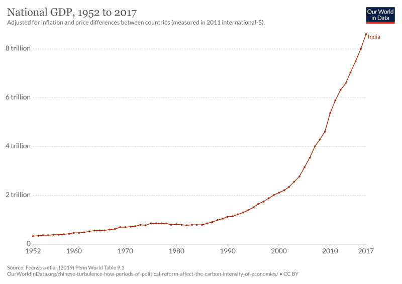
This is best exemplified by the graph already shown above. In it, we tracked the change in the closing price of a stock over a period of time. This is one most basic and widely used applications of line charts. Let’s take a look at another example. The below graph plots the national GDP (PPP) of India from 1952 to 2017.
Credits: ourworldindata.org
Here the variable we are tracking is India’s national GDP (PPP). The data is collected each year and points are connected using straight lines. The graph helps easily visualize the economic boom going on in the country.
Comparison of changes in different groups
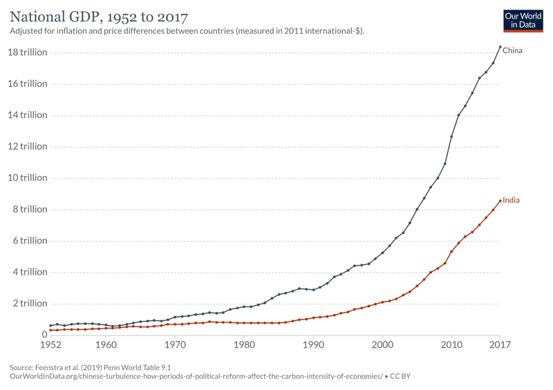
Now it is time to see how we can utilize line charts for comparing the performance of two different groups. For this purpose, we will simply add the growth data of China in the same graph.
Credits: ourworldindata.org
As we can see, China has grown disproportionately better than India just by looking at the graph. Hence plotting a line graph makes it very easy to compare changes of two groups during the same time frame.
Identifying trends
Identifying trends early on is very useful because it helps us capitalize on them. This is true whether we pick up a trend in the stock market or a trend in real-life scenarios. There are times when something blows up (like fidget spinners) for a period of time. We can capitalize on that trend (in this case, selling fidget spinners).
Google search frequency of term “fidget spinner” over time. Screenshot from Google Trends.
The above graph shows the google search frequency of the term “fidget spinner” over time. Suddenly the search term blows up during 2017 as fidget spinners had become a popular trend in that particular year.
Future prediction
One could say future prediction is not a distinctive application of line charts. This is because, in all the above 3 applications, one of the intentions is always to realize what’s coming in the future. So future prediction is always present whenever we draw a line chart. However, one can try to predict the future just by physically extending the line chart. This is also a naive method to be dependent on because line charts might not often show a proper up or downtrend. Hence, simply extrapolating the graph becomes impossible.
Predicting the future using the line graph depends on the knowledge and skill level of the evaluator. If someone is an expert day trader, a trend line has whole more information to tell him than a random person looking at the same graph. There is no formula that will automatically and accurately give us future data points. Maybe one can make a machine learning algorithm. But expertise is still needed.
Plotting line chart using python (matplotlib)
Using matplotlib to plot a line graph is easy. But one might have a hard time getting used to it in the beginning. Since the logic behind drawing a line graph is the same for every graph, the steps to achieve them in python is also the same. Hence once we regularly start plotting them, we will get used to it. We will be plotting 2 line charts. The first one will be a simple graph and the second one will show more features. In both cases, we will be following a step-by-step process. One can find the complete program towards the end.
Plotting a simple line graph
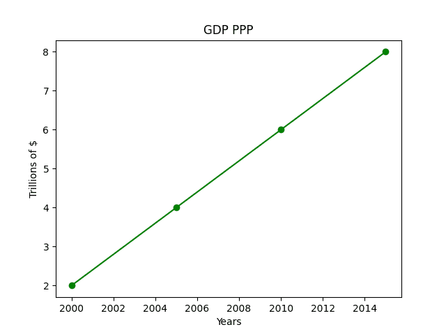
For this purpose, we will be trying to imitate the GDP (PPP) growth of India after the year 2000. Data accuracy is questionable. The intention is to show how a typical line graph will look. There will only be 4 points. The GDP (PPP) numbers are in trillions of USD. A real and accurate graph was already shown in the beginning.
STEP 1: Import pyplot method from matplotlib
from matplotlib import pyplot as pltSTEP 2: Establish time frames and data as lists
years = [2000, 2005, 2010, 2015]
gdp = [2, 4, 6, 8]
STEP 3: Invoking plt.plot which is the plotting function
plt.plot(years, gdp, color='green', marker='o', linestyle='solid')')The first two arguments provide x and y values. All additional arguments are for aesthetic purposes. Feel free to experiment with them. One can find detailed documentation of matplotlib.pyplot.plot method here.
STEP 4: Providing title, x-label, y-label
plt.title("GDP PPP")
plt.xlabel("Years")
plt.ylabel("Trillions of $")
STEP 5: Simply calling plt.show()
plt.show()Please notice how matplotlib automatically adjusted and increased quantities in both the x and y-axis. Here is the complete code of the program.
from matplotlib import pyplot as plt
years = [2000, 2005, 2010, 2015]
gdp = [2, 4, 6, 8]
plt.plot(years, gdp, color='green', marker='o', linestyle='solid')
plt.title("GDP PPP")
plt.xlabel("Years")
plt.ylabel("Trillions of $")
plt.show
Plotting a more feature-rich line chart
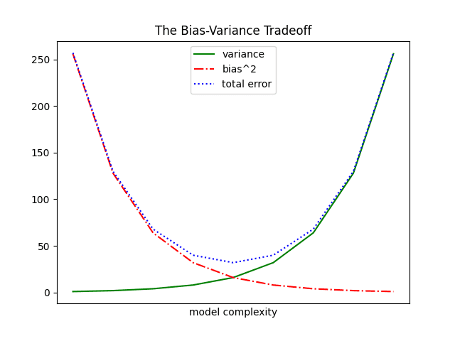
Now we will be plotting a line chart with multiple lines, colors, line styles, etc to get a grasp of how we utilize the features of pyplot method. For this purpose, we will be plotting a graph showing the bias-variance tradeoff and the accompanying error. It’s okay if one is not aware of them. It’s a machine learning related topic that is eventually waiting down the line to be learned in our data science journey. However, it does not matter for now as we are just looking to explore the features of pyplot.
STEP 1: Import pyplot method from matplotlib
import matplotlib.pyplot as pltSTEP 2: Variance and bias squared list
variance = [1, 2, 4, 8, 16, 32, 64, 128, 256]
bias_squared = [256, 128, 64, 32, 16, 8, 4, 2, 1
STEP 3: Calculating error
total_error = [x + y for x, y in zip(variance, bias_squared)zip() takes in two or more lists as arguments and forms a new list. The values in the new list will be tuples made of elements having the same index in the original list. If the lists we passed as arguments have different length, zip() will stop when the first list runs out. Variables x and y contains values of variance and bias_squared. Summing variance and bias_squared will give us the mean squared error which is saved in the list total_error.
STEP 4: Enumerating variance.
xs = [i for i, _ in enumerate(variance)]enumerate() creates a new list containing tuples of index number and value. The underscore is used to skip the second items in the tuple. Variable i stores the index values. Hence XS becomes a list containing index values of the list variance. Here that will be [0, 1, 2, 3, 4, 5, 6, 7, 8].
STEP 5: Plotting variance, bias squared, and the error.
plt.plot(xs, variance, 'g-', label='variance')
plt.plot(xs, bias_squared, 'r-.', label='bias^2')
plt.plot(xs, total_error, 'b:', label='total error')variance
The first two arguments are for x and y values. g- represents a green solid line. r-. represents a red dot-dashed line. b: represents a blue dotted line. Feel free to experiment. label attribute is self-explanatory.
STEP 6: Adding legend to our graph
plt.legend(loc=9))This works since we have given label to each of our series in step 5. plt.legend will simply display them. The value loc=9 is passed if we want the legend to be shown at the upper center. Here is the list of values one can refer to if he wishes to change the location.
Location String Location Code
'best' 0
'upper right' 1
'upper left' 2
'lower left' 3
'lower right' 4
'right' 5
'center left' 6
'center right' 7
'lower center' 8
'upper center' 9
'center' 10
STEP 5: Marking labels/ticks
plt.xlabel("model complexity")
plt.xticks([])
plt.title("The Bias-Variance Tradeoff")
An empty list is passed for xticks because we don’t want any markings.
STEP 6: Simply call plt.show()
plt.show()Here is the complete code.
import matplotlib.pyplot as plt
variance = [1, 2, 4, 8, 16, 32, 64, 128, 256]
bias_squared = [256, 128, 64, 32, 16, 8, 4, 2, 1]
total_error = [x + y for x, y in zip(variance, bias_squared)]
xs = [i for i, _ in enumerate(variance)]
plt.plot(xs, variance, 'g-', label='variance')
plt.plot(xs, bias_squared, 'r-.', label='bias^2')
plt.plot(xs, total_error, 'b:', label='total error')
plt.legend(loc=9)
plt.xlabel("model complexity")
plt.xticks([])
plt.title("The Bias-Variance Tradeoff")
plt.show()
Conclusion
A line chart also known as a line graph is the easiest but most useful tools in the data visualization world. They are generally used to track the changes of a variable over time. They can also be used for comparison of different groups, to observe trends, and predict the future. Then we went on to plot a simple line chart using python with the help of the matplotlib module. Later we learned to plot a more complex feature-rich line graph. Hopefully by now, one has a good understanding of line charts and how to generate them using python.
